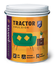
 Everyday
Tractor
Emulsion
A dependable starting point for straightforward, well-prepared interior walls.
Architectural coatings and finishes that bring depth, protection and a more personal point of view to every space.
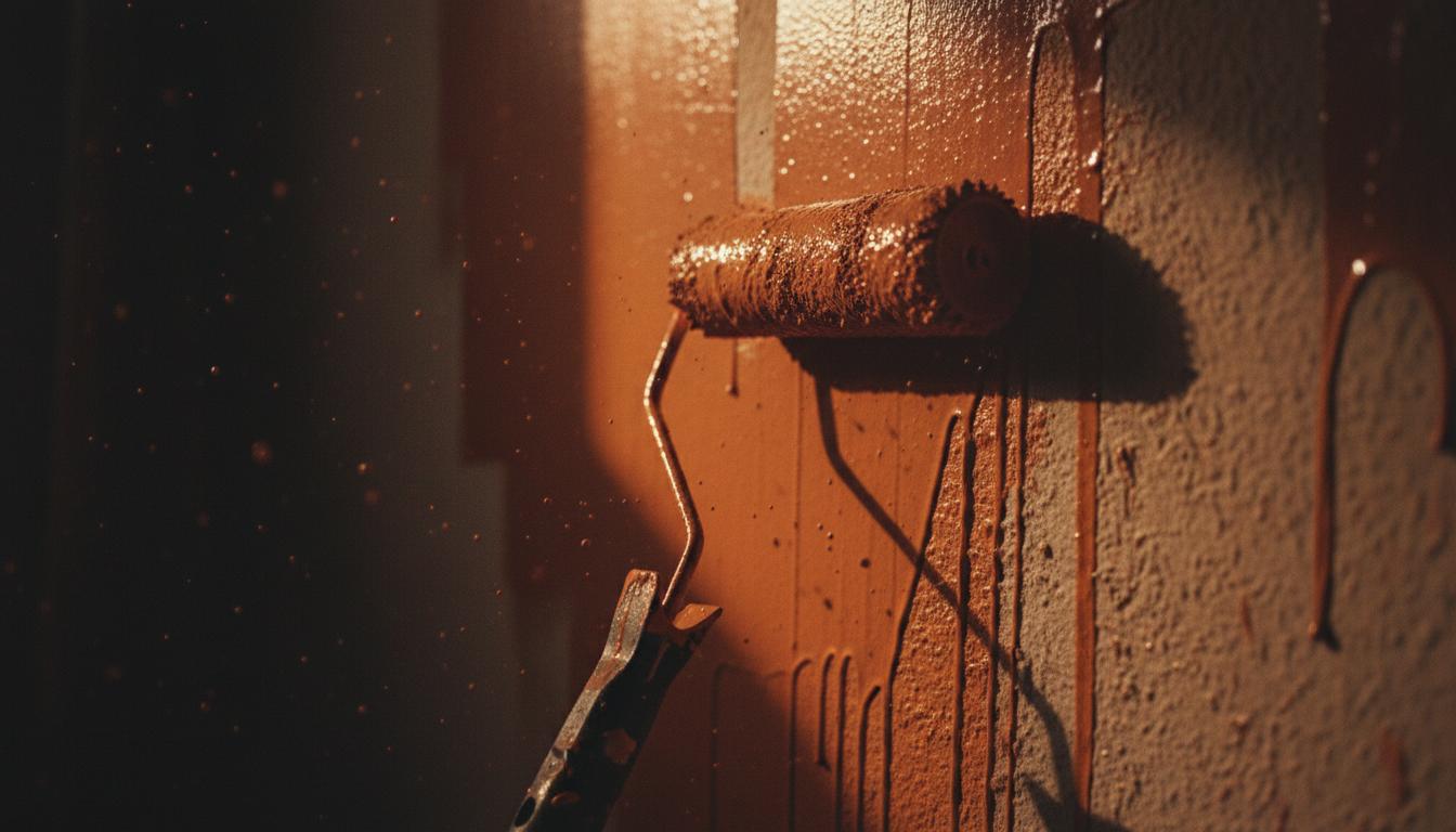
We pair the right preparation, coating and application method with the realities of your site. The result feels intentional on day one and continues to perform through daily life and weather.
A considered shortlist of systems we can specify for your project. Compare the finish and material price, then add your preferred system to your enquiry.
EverydayA dependable starting point for straightforward, well-prepared interior walls.
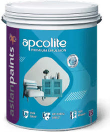 Premium
A refined interior emulsion for homes that need stronger stain care and everyday durability.
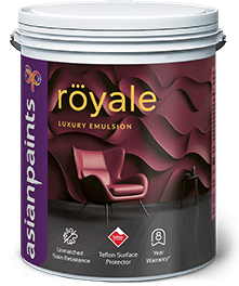 Luxury
A wash-friendly, high-depth finish for main rooms and detail-conscious interiors.
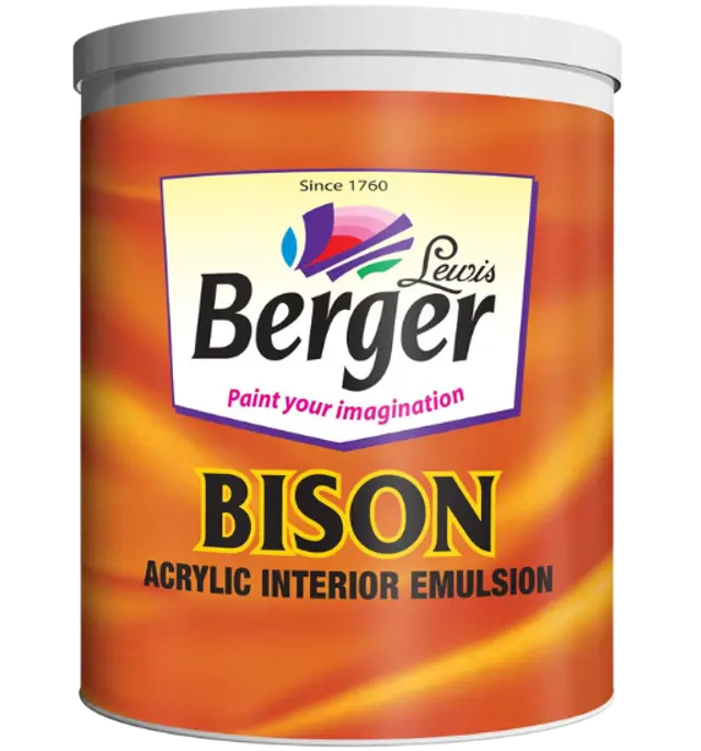
 Everyday
A balanced wall coating system for practical, clean interior repainting projects.
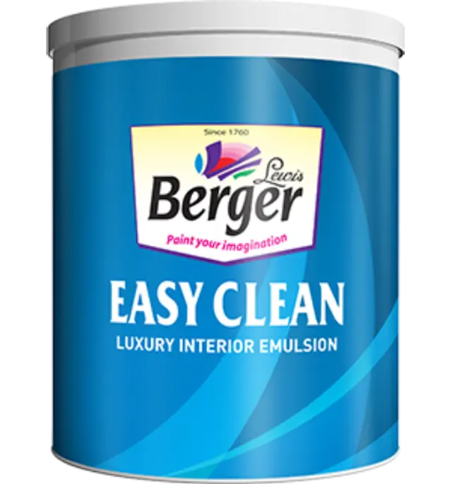 Premium
A premium washable option for high-touch spaces where maintenance matters.
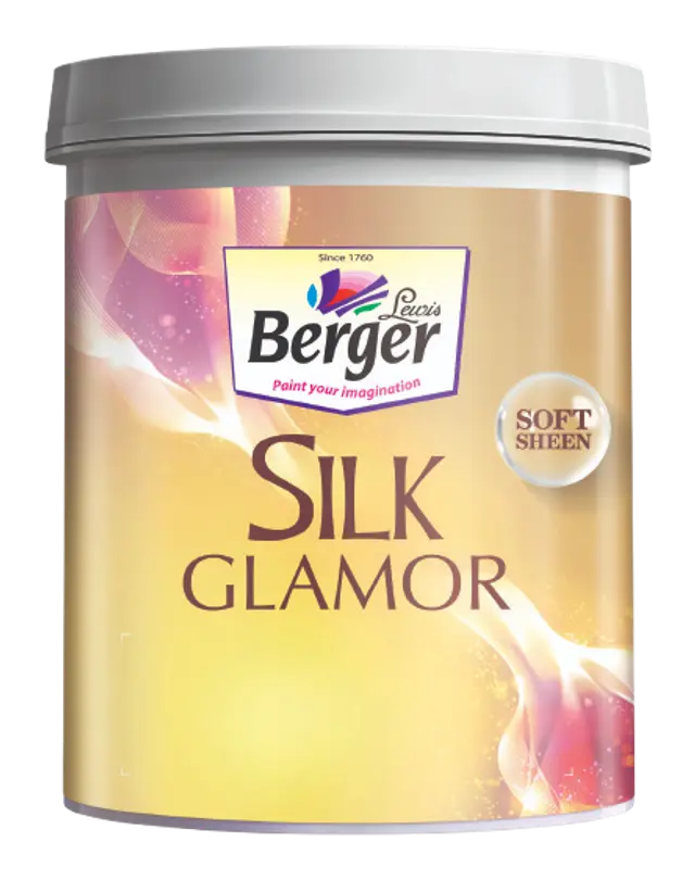 Luxury
A richer, more expressive surface for feature walls and premium interior schemes.
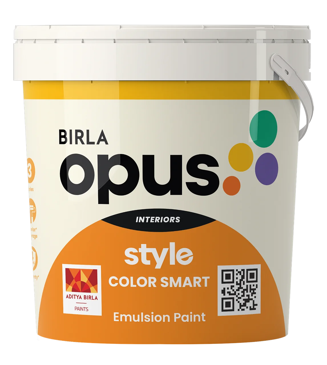
 Everyday
A value-focused interior emulsion for a smooth, practical finish.
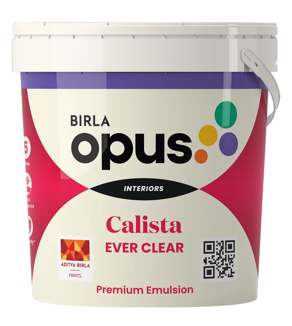 Premium
A higher-performance coating selected for rooms that need a cleaner, more protected surface.
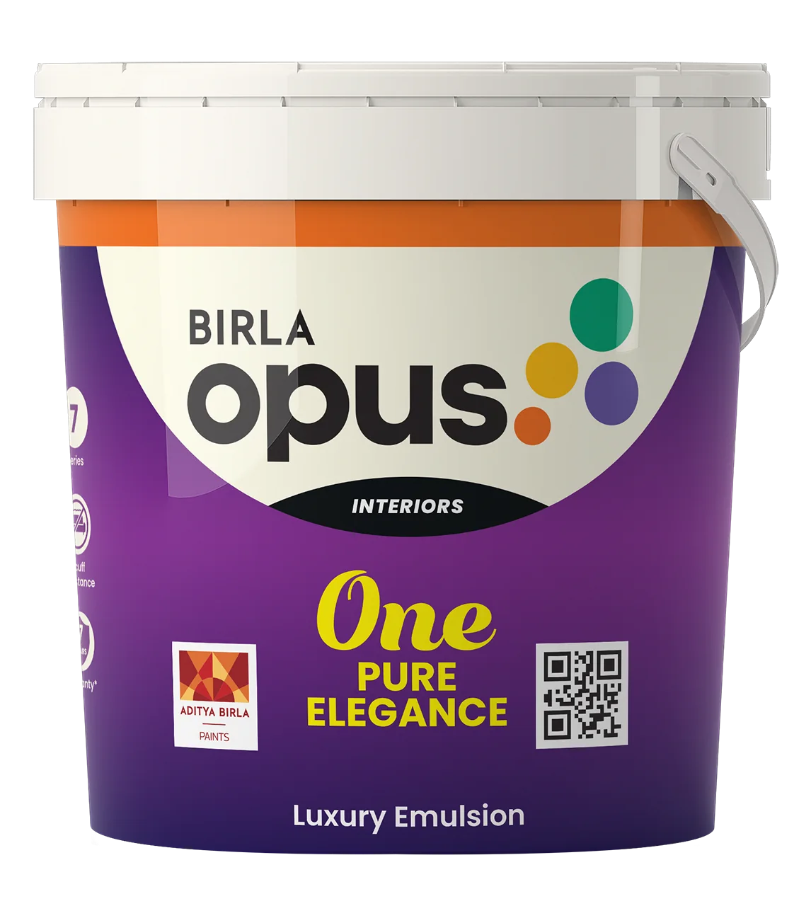 Luxury
A luxury finish for carefully designed spaces with a focus on depth, feel and easy upkeep.
 Exterior
High-performance exterior protection with colour retention and anti-algal defence.
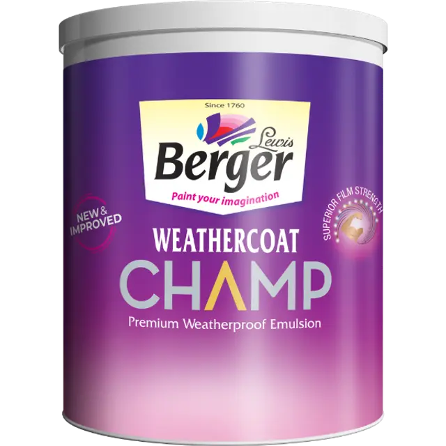 Exterior
A soft-sheen weatherproof emulsion designed to strengthen and protect façades.
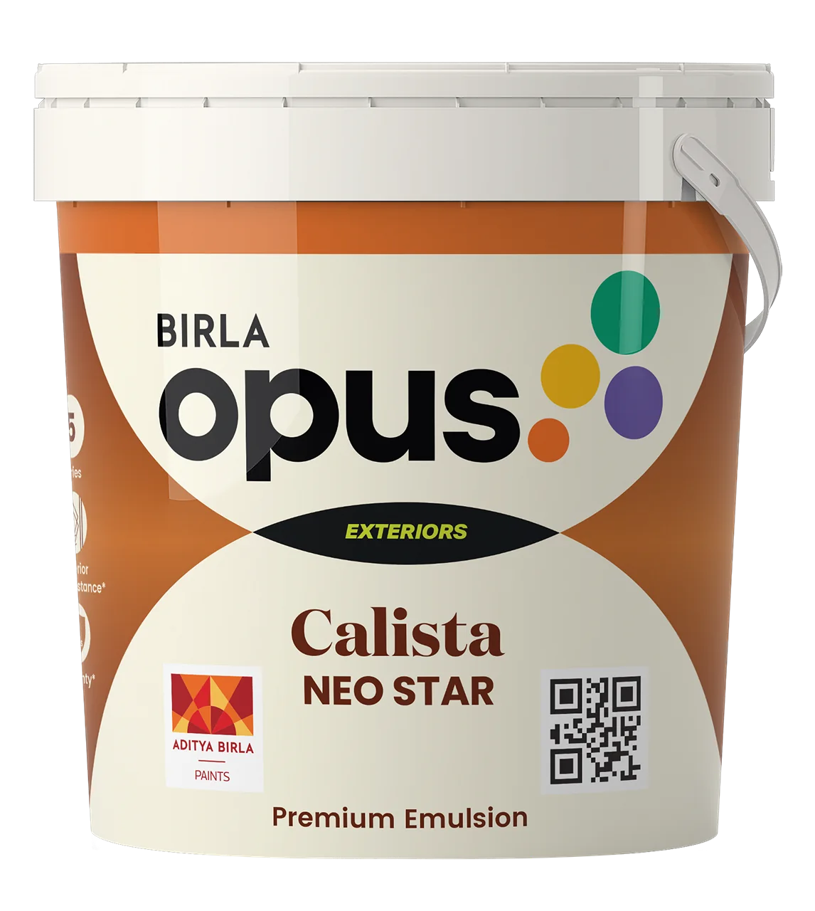 Exterior
A resilient exterior emulsion for dust resistance and long-lasting film integrity.
Price clarityAsian Paints figures are published material MRP per litre; Birla Opus figures are observed online starting prices. Pack size, tint, city, dealer availability, labour, preparation and offers can affect the final project price. Berger figures are indicative installed-price ranges; the detailed quote confirms current material availability and project scope.
Choose a starting point. We help turn it into a finish system that suits the room, the architecture and how it will be used.
Washable, low-sheen finishes for homes, hospitality and spaces that are lived in.
Discuss interior finishes →Coating systems that respond to sun, rain, moisture and the character of the facade.
Discuss exterior coatings →Limewash, stucco and tactile finishes that add a new register to a room.
Explore textured surfaces →Waterproofing and surface preparation that protect the finish you see.
Plan a protective system →Choose a year to explore its Colour of the Year. Each update brings its own tone, reference code and a practical way to use it in a real space.
A quieting white
Use it as a quiet whole-home base, then let warm earth, soft blue or deep charcoal create the contrast. It works especially well with natural stone, timber and handmade surfaces.
Colour codes are visual references only. Screen calibration, paint finish, primer and site light can all affect the result. Always approve a physical sample.
Eight starting points built for real rooms. Select any colour to send it to the Paint Reference tool and keep exploring.
Taupe, terracotta, oak and espresso—warm, grounded and inviting.
Soft blues with off-white and a deep navy-teal anchor.
Sage to deep forest with receptive cream highlights.
A bold statement palette with warm gold anchors.
A warm-grey gradient for quiet, considered spaces.
Warm peach through to deep oxblood—inviting and architectural.
Soft mineral neutrals with layered depth and warmth.
Deep cocoa and mahogany balanced by caramel warmth.
Texture gives a surface a different relationship with light. These are starting points for a finish tailored to your project.
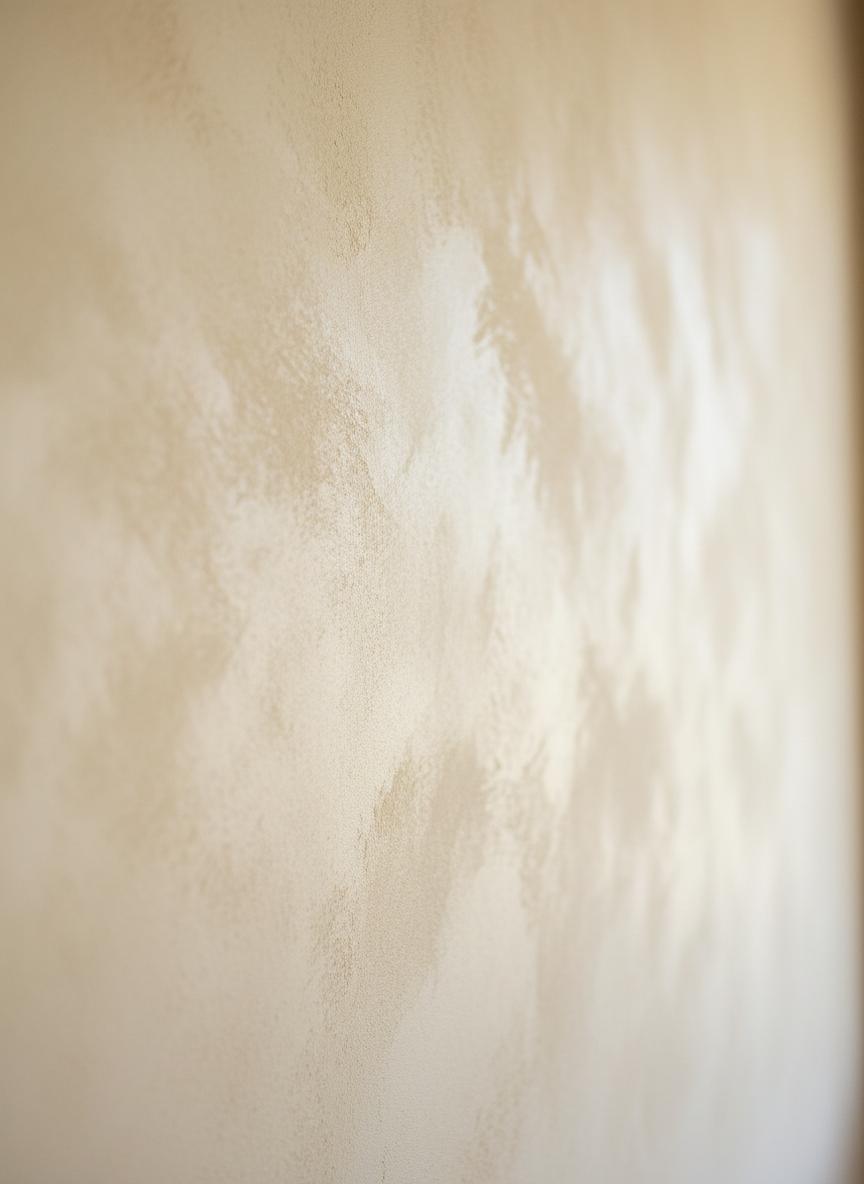
Clouded, mineral movement.
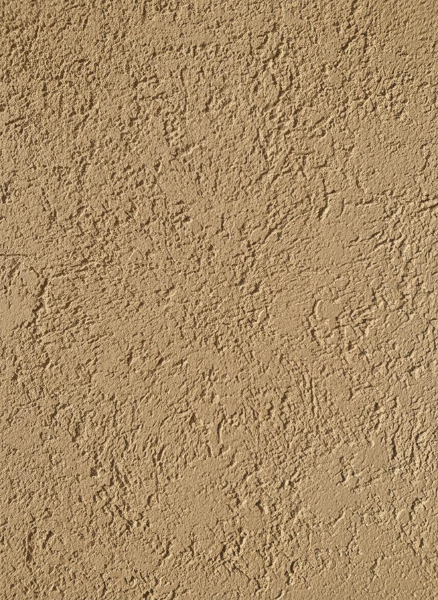
Polished depth and character.
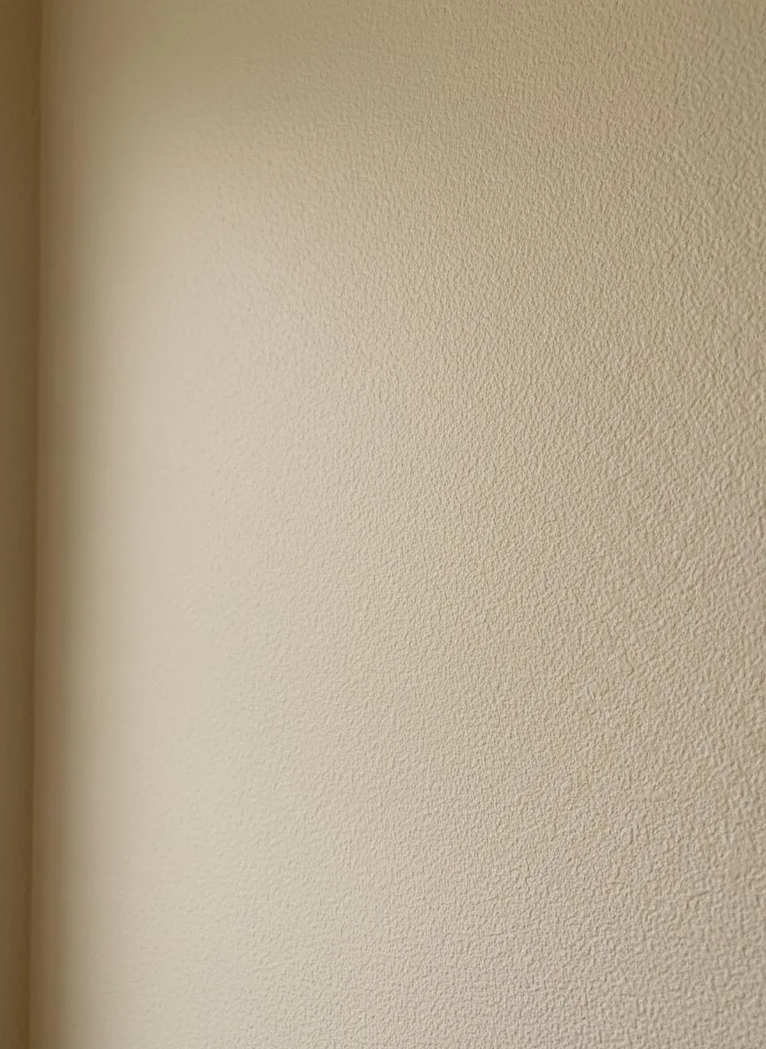
A subtle granular finish.
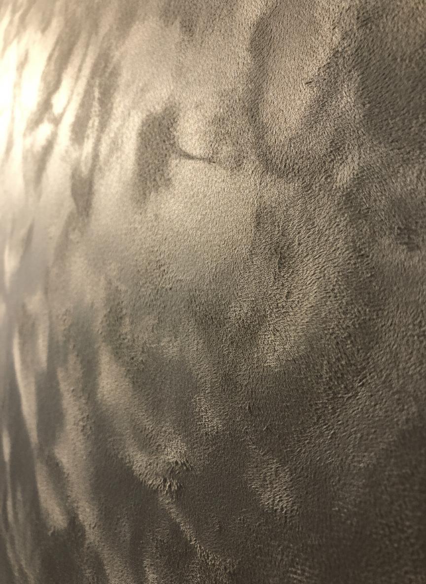
Soft-touch visual warmth.
Pick a screen colour or enter a HEX value. We’ll generate a shareable Exalt colour reference for your consultation.
Cloud Dancer family · verify with a physical sample.
Real room moods, made from the same kinds of colour and material relationships we explore with clients.
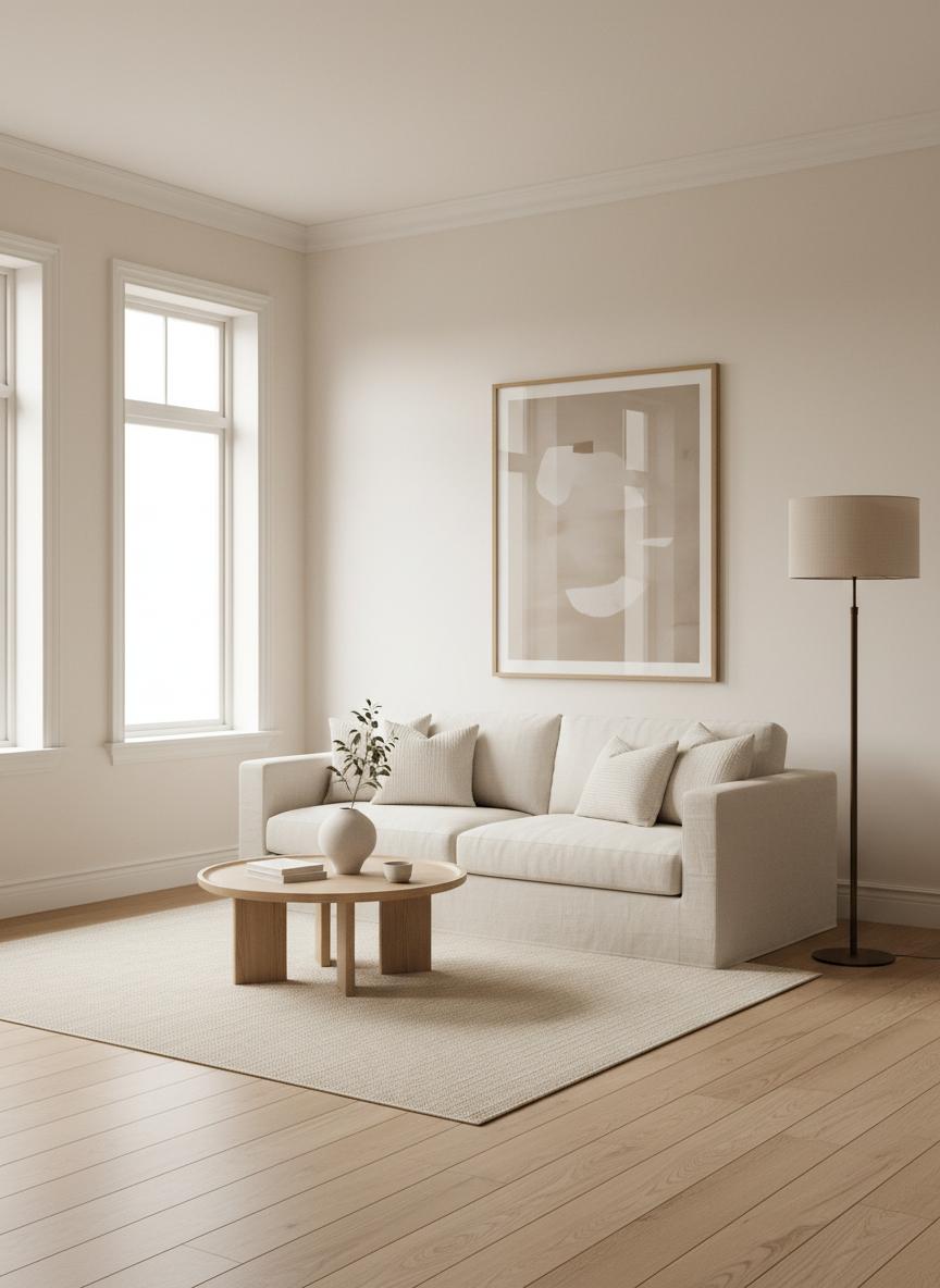
A warm, light-catching living room neutral.
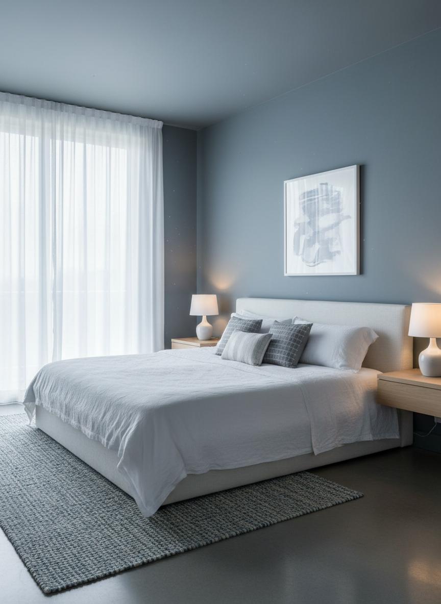
A restful blue with depth.
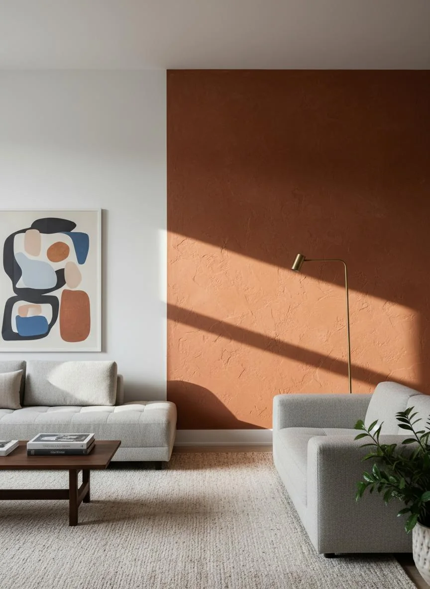
An architectural accent tone.
Tell us about the space, the surfaces and the feeling you want to create. We’ll come back with a useful next step.